
Flower Colours and Seasonal Palettes: A Florist's Complete Guide
Colour is what sells a bouquet before anyone reads the price. A complete guide to colour theory for florists, seasonal palettes, trend shades and sourcing by colour.
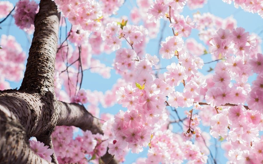
Colour is the first thing a customer sees and the last thing they forget. Long before anyone weighs the flowers or reads the price, the colour has already said "buy me" or "walk past." For a florist or buyer, understanding colour is not decoration — it is commercial. This guide covers colour theory in practical florist terms, the palettes that work, the seasonal colour stories that drive sales, and how to source flowers by colour so the shades you plan are the shades you get.
Why colour sells before anything else
A bouquet is bought emotionally and fast. Colour carries that emotion — red reads as romance, white as elegance and sympathy, yellow as friendship and cheer, pastels as softness, brights as celebration. A well-chosen palette makes a modestly priced bouquet look considered and desirable, while a clashing one makes an expensive bouquet look cheap. Because colour does so much of the selling, planning your range around colour — not just around flower type — is one of the highest-return habits a buyer can build.
Colour theory for florists
You do not need to be a colour scientist, but a few working ideas make every bouquet better.
- Monochromatic: shades and tints of a single colour (soft pink to deep rose). Calm, elegant, hard to get wrong.
- Analogous: colours next to each other on the wheel (peach, coral, pink). Harmonious and rich, the backbone of most romantic designs.
- Complementary: colours opposite each other (purple and yellow, blue and orange). High-contrast and striking — powerful in small doses.
- The role of white and green: white brightens and separates; green rests the eye and frames. They are the punctuation that makes the other colours read clearly.
- Value and saturation: mixing light and dark tones adds depth; mixing a vivid flower with muted ones stops a bouquet looking flat.
Most successful commercial bouquets are analogous or monochromatic with white and green support — safe, beautiful and repeatable.
Building a palette that sells
A reliable working method: choose one lead colour (the emotional message), add one or two supporting colours (analogous for harmony, or one complementary accent for energy), then anchor with white and green. Keep the number of strong colours small — two or three doing clear jobs beats five competing. Match the palette to the occasion (romance, sympathy, celebration, everyday gifting) and to the price point (premium bouquets can carry subtler, more sophisticated combinations; value bouquets sell on cheerful, clear colour).
Seasonal colour stories
Colour follows the calendar, and selling with the season means fresher flowers, better prices and easier availability.
- Spring: soft pastels — blush, peach, lilac, buttercream, fresh green. Optimism and new starts.
- Summer: saturated brights and clean whites — coral, hot pink, sunflower yellow, bold blue. Energy and abundance.
- Autumn: rust, burgundy, gold, terracotta and antique tones — the season of hydrangeas turning vintage and warm chrysanthemums.
- Winter: deep reds, pure whites, rich evergreen and touches of metallic warmth — festive elegance and, of course, the Valentine's red that follows.
Leading customers to a seasonal palette is the simplest upsell in the shop: it feels current, it photographs well, and it happens to align with what is freshest and best-value.
Trend and novelty shades
Beyond the naturals, demand moves toward specific fashion shades — muted "sorbet" tones, dusty and antique colours, moody dark burgundies and near-blacks, and clean brand-matched brights for events. Many of these are achieved with tinting, and some flowers take it far better than others: carnations and gypsophila are the great tinting canvases, delivering blues, teals and exact novelty shades that do not occur naturally. For weddings and promotions where a precise colour is required, tinted flowers are often the only reliable route to the exact shade.
Sourcing by colour: getting the shade you planned
The frustration every florist knows is ordering "burgundy" and receiving something closer to red. Colour names are imprecise across growers, and natural colour varies by variety, season and crop. Three habits fix most of it: specify by variety where the colour is critical (a named variety is far more predictable than a colour word), buy the colour in season when it is truest and most available, and work with a supplier who grades colour consistently and can commit specific varieties ahead of the date. For exact, non-natural shades, plan for tinted product. Getting the colour right is as much a sourcing discipline as a design one.
Colour and vase life
One practical note: colour and longevity sometimes interact. Very dark reds and purples can show ageing (browning at the edges) more visibly than pale tones, and some tinted flowers should be handled gently to keep the colour clean. None of this is a reason to avoid them — just to buy fresh, keep the cold chain tight, and rotate darker tones with a little more attention on the shelf.
Buyer's FAQ
What flower colours sell best?
It depends on occasion and season, but reds (romance and Valentine's), whites (weddings, sympathy, elegance) and soft pinks/pastels (everyday gifting) are the perennial leaders, with seasonal brights and antique tones driving interest at the edges.
How do I build a flower palette that works?
Choose one lead colour, add one or two supporting colours (harmonious analogous tones, or a single complementary accent), and anchor with white and green. Keep the strong colours to two or three.
How do florists get blue or novelty-coloured flowers?
Mostly through tinting. Carnations and gypsophila take colour exceptionally well, producing blues, teals and exact novelty shades that do not exist naturally — the standard route for precise event and brand colours.
Why did the colour I ordered arrive different?
Colour names are imprecise and natural colour varies by variety, season and crop. Specify by named variety when colour is critical, buy in season, and use a supplier who grades colour consistently.
What are antique flower colours?
Vintage, muted tones — greens, burgundies and dusky shades — that mature blooms (especially hydrangeas) develop late in the season. They are prized for autumn weddings and sophisticated design.
Sourcing colour with Vibra
At Vibra we select for true, consistent colour across Colombia and Ecuador, can commit specific varieties ahead of your season, and offer tinted flowers for the exact shades events demand. Tell us the palettes you sell and we will make sure the colours you plan are the colours that arrive.
Build your program
Tell us what you need. We will bring the right flowers, growers, and solutions together.
Request a quote